For the logo, the client wanted a dog ("Orso"). The dog had to be
friendly with floppy ears and dreaming. The values associated with the
logo and the dog are "expression", "discovery" and "thinking". For the
title, I increased the kerning between the letters to improve
readability and leave more space for the "O" (key point of the visual
identity, see below)
![Logo of a blue dog with papers falling]()
![Logo of a dog with papers falling on grey background]()
![Animation of a logo]()
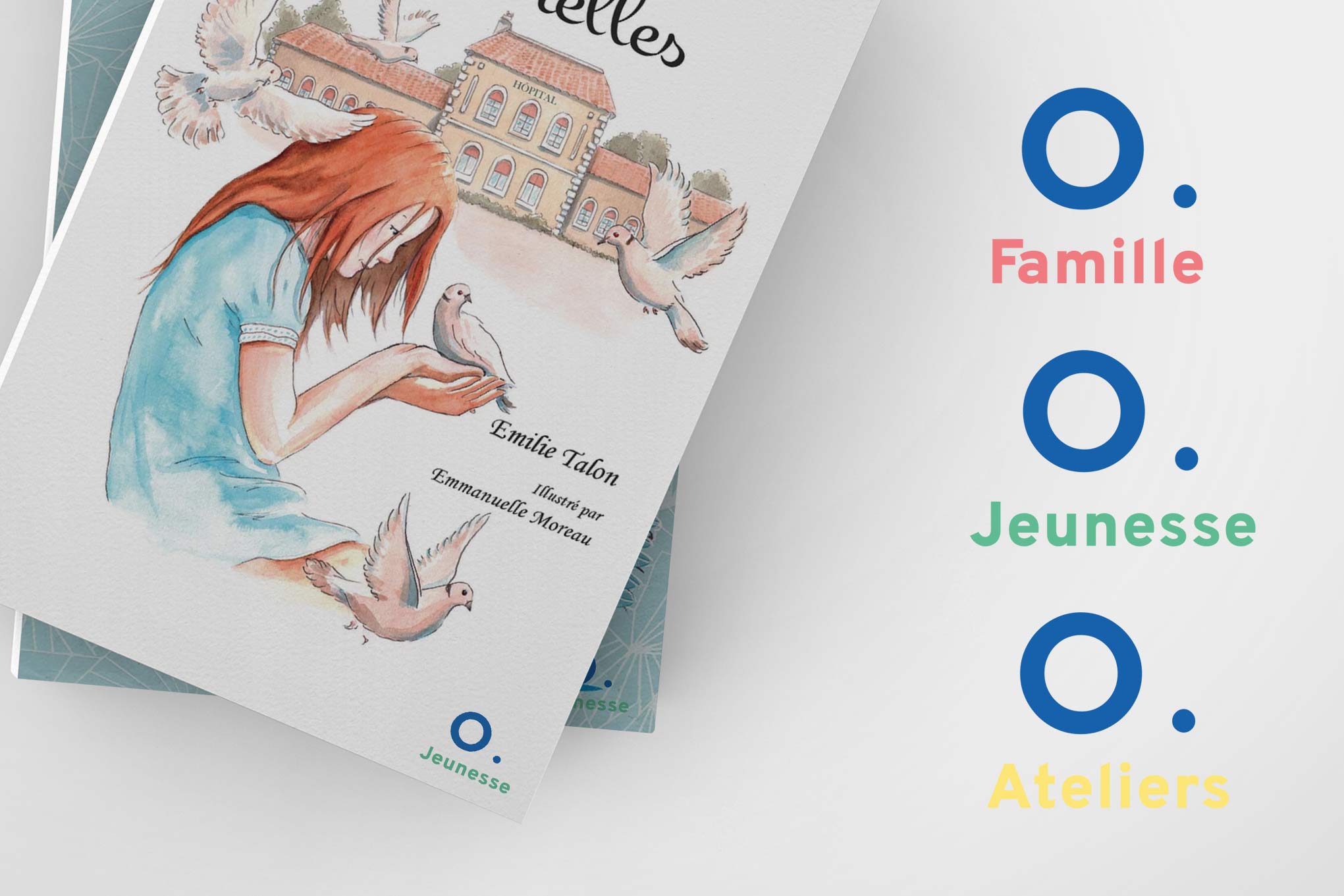
«Orso» can be shortened to the single letter «O» and it is a key point
of this visual identity. The visuals are lighter but well recognizable.
Furthermore, the shortcut can also have other uses such as a tag for the
future collections (for example «O. Adventure», «O. Children», etc...).
![Graphic charter with 5 colors (blue, salmon, grey, green, yellow)]()
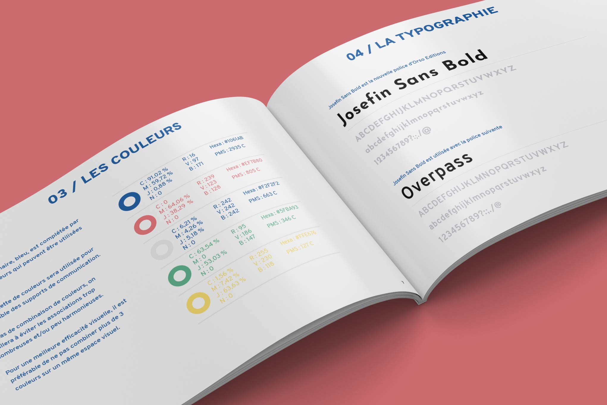
The two main colors are blue and salmon along with three other colors
that will be used occasionally. The two fonts are Sans Serif for a more
friendly and youthful feeling.
![Graphic charter with 5 colors (blue, salmon, grey, green, yellow)]()
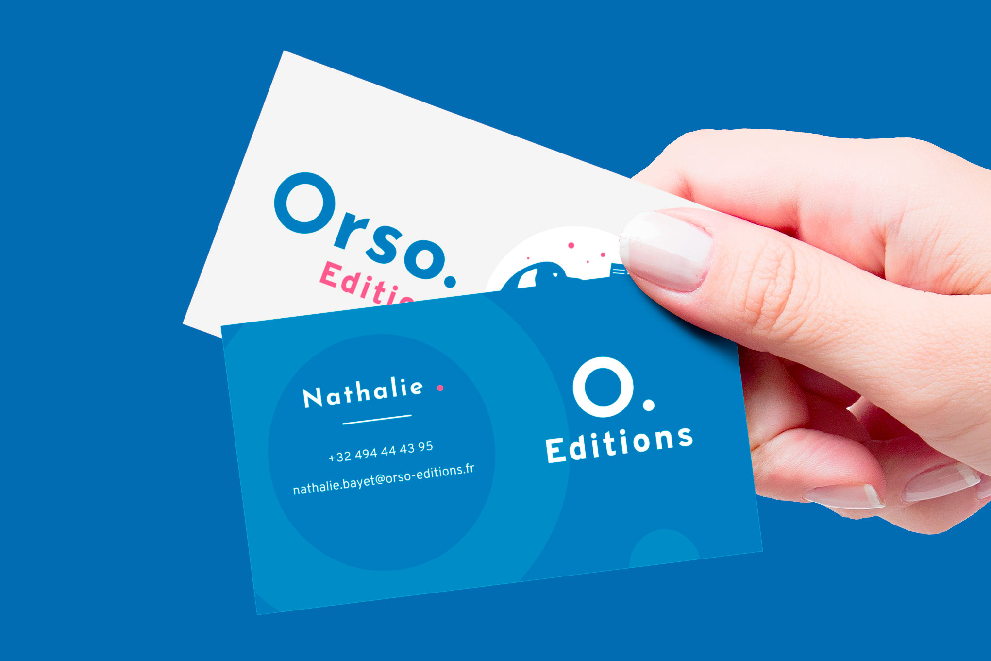
The business cards are simple yet recognizable. «Orso» is shortened to
the single letter «O» and the "O." is again emphasized in the background
of the card.
![Business cards of Orso Editions with blue as the main color]()
![Horizontal banner with a blue dog]()
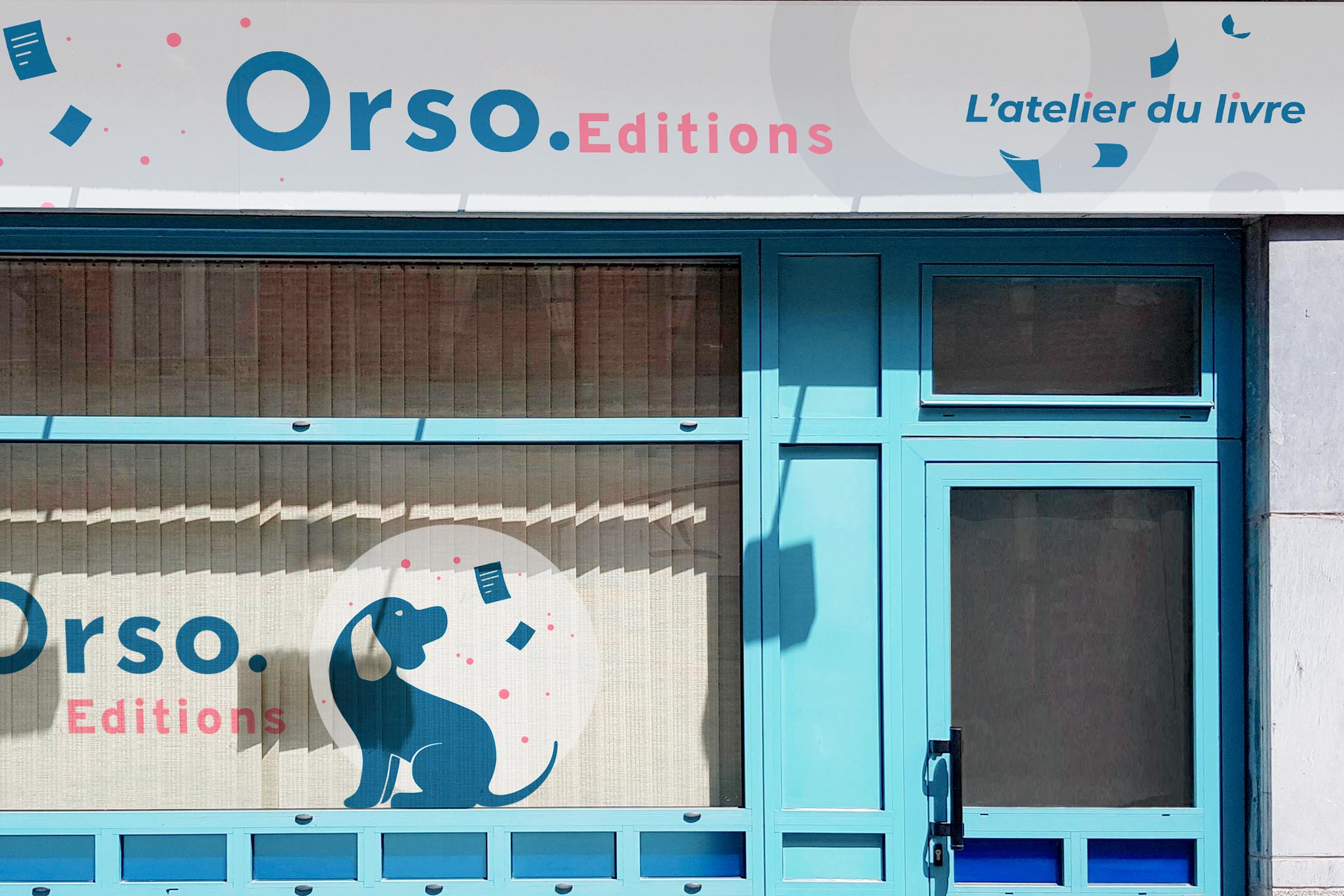
In addition to the branding, I created other visuals like these stickers
below for the front of their offices.
![Sticker of a dog on the front window of an office]()
